The Usefulness and Headache of UI Frameworks
23 Feb 2022Introduction
Being introduced to UI Frameworks through assignments and WODs was an interesting experience to say the least. Starting off with building a website with just HTML and CSS seemed simple enough. I just had to format my lines properly and make sure everything was organized. “Simple enough.” I thought to myself before getting to try out UI Frameworks. I didn’t think that UI Frameworks would be such a pain in the butt to use just to make a website.
Experience with using UI Frameworks with Island Snow
I want to put out a disclaimer first about my opinion on UI Frameworks. It is a very useful tool when building websites. If (and this is a big if), the user is experienced with using it in the first place. Let’s jump to my first assignment, the Island Snow website. I’m not going to lie, it wasn’t that bad in terms of difficulty. Even though I failed to complete the tasks within time limit on my first try, after watching the videos I was able to get through the tasks easily. It was a lot easier using pre-set icons from Semantic UI and there a significantly less amount of formatting in my CSS file. The reason being is that there are some key terms in Semantic UI that can help place paragraphs or images where I want with little editing to my CSS file.
Experience with Recreating a Website of My Choosing
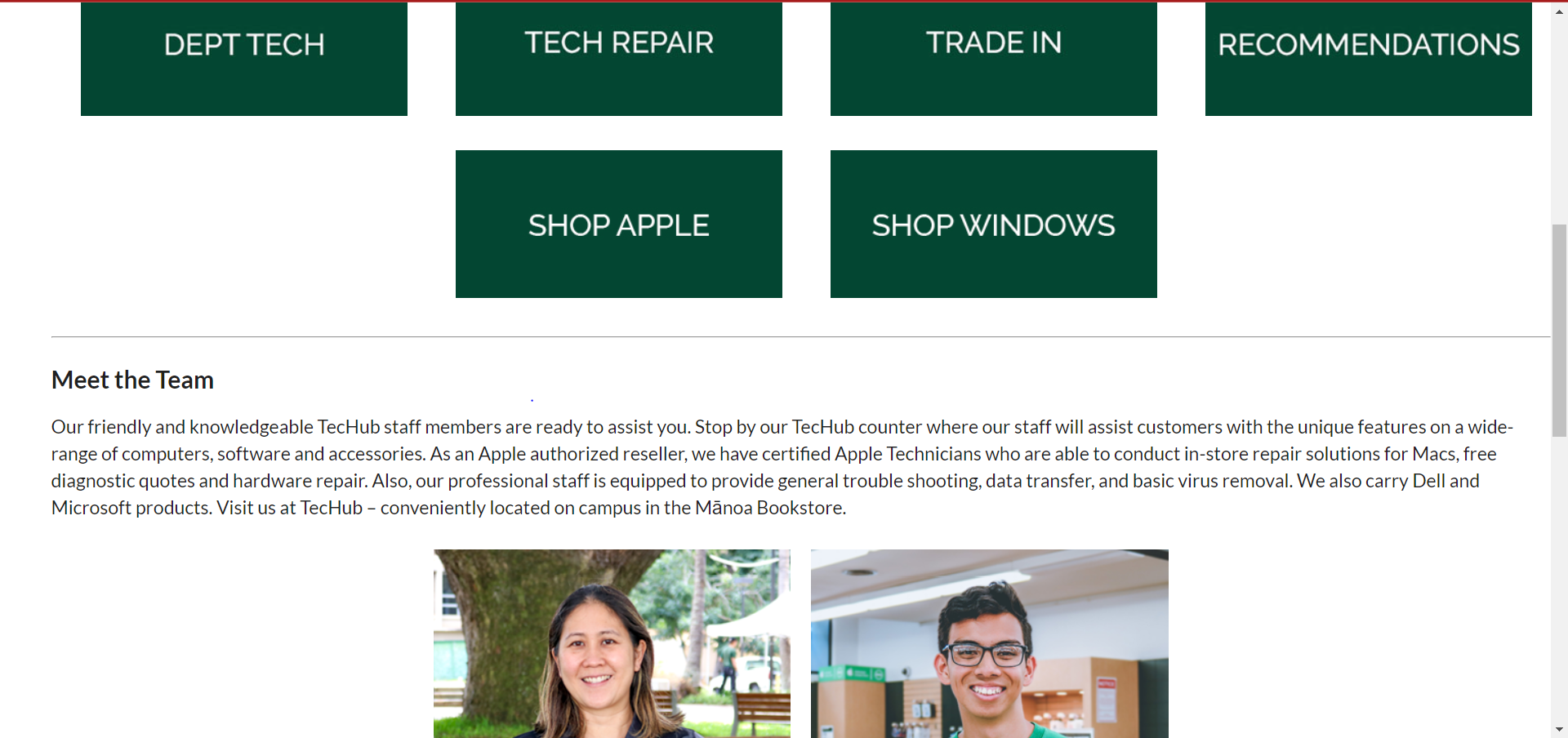
Now this is where everything went wrong for me when using Semantic UI. I was tasked to recreate a website of my choosing. I ended up choosing the UH Manoa Bookstore Techub about page thinking it would be easy. This is what my recreation looks like.


If looking at top of the website, it was relatively simple as I just made the background and set the title with contact. Even the dropdown menu was simple using Semantic UI since I just made one dropdown and then copied it and changed the items per dropdown. One of the challenging parts of this is that I had tried to align the user sign-in logo and the cart logo and it did not want to align. I spent about 2 hours trying to fix it with my CSS file as well as trying different Semantic UI options. When I figured this issue out, I had to take a break since it was so simple, yet so frustrating to figure out.
When it came to the middle of the website, creating it was also relatively easy to do as I was able to just use Semantic UI’s “UI grids” as well as aligning it center to recreate the images and bios of the employees. However, the footer was a nightmare for me to figure out as this was unknown territory for me. I couldn’t figure out how to match the columns where the underline would only be under the “Textbooks”, “Merchandise”, “Store”, and “Find Us”. I tried doing five columns with the UI grid but to no avail as everything became a jumbled mess. Another issue is that my button didn’t come out the way I wanted to as well as I couldn’t figure out how to properly set the background and color of the button without messing up the shape of it as well. Overall, I managed to finish this project after 8 hours (overall not back-to-back) with minor flaws to the website.
Thoughts and Opinions

I really think UI Frameworks can be useful when creating a website since it has very useful tools to build a website. However, I think it’s useful if you have more experience with this since you would be able to make websites with ease. One caveat is that if a client wants a website to be very elaborate, I think there are some limitations to UI Frameworks since a client might ask for specifications that might not be available like having a carousel of images that lead to different parts of the website. It’s hard to say since I just dipped my toes into UI Frameworks, but if I get more experience with developing websites, it’s a valuable tool to help clients. But for now, I’ll suffer through practicing on recreating websites.